So here they are--in only approximate order--favourite to least favourite, the best covers of the books I read in 2015. These first three are in a group by themselves: my favourite favourites. They are all pretty much equal in my mind, and the ordering is basically random. (Note that I am not in any way an artist or designer or anything, so these are based purely on what I like in book covers.)
Arriving at Amen. It's a rosary in the shape of an atom superimposed on a galaxy. What combination could possibly be better? Plus I just really like the colour scheme.
As you can tell by Knife, by Arriving at Amen above, and by a couple covers mentioned below, I have a tendency to like more monochromatic and minimal covers, especially when they're blue. Add to that the fierce but delicate stance of the title character, and you get an awesome cover indeed.
There is just such distinctiveness in Cinder's cover: the striking single image, made more striking by the eye-catching red shoe; the faint strangeness of the mechanical insides that you don't see until looking closer; the vaguely steampunk feel given by the single-word title text. I always noticed this cover in stores or blogs, and it's simplicity appealed to me. Note: I am including a nod to the rest of the series here as well (Scarlet, Cress, and Winter), because the series as a whole has has a lovely consistency in colour scheme and noticeability (Scarlet especially).
Now here are the rest, which are also really good, but distinctly not as enjoyable to me as the first three. But like the first three, they are fairly equal in preference to each other, the ordering depending more on mood than anything else.
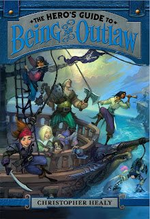
Another favourite kind of cover, besides monochromatic ones, are covers with well-depicted character illustrations. The first two books in this series were on the favourite cover lists of their perspective years, and The Hero’s Guide to Being an Outlaw follows their lead. All the characters are so decidedly themselves and so different from each other, and it just looks so fun. The same artist illustrated the inside of the book as well, and it was one of my favourite parts of reading this series.
Steelheart is another beautifully monochromatic cover, but in grey this time. I also love the contrast the bit of blue/green text makes with the grey, and the swirly bits with the more angular buildings. It looks really nice beside the other Sanderson books by same publisher. (I bought this from the UK Amazon despite heavy shipping fees, because Sanderson's UK covers are WAY better than the US ones.)
The horse, the cloak and dress, the golden sunlight, the dragon in the distance. Handbook for Dragon Slayers is the kind of illustrated cover I love.
The light!! The Castle Behind Thorns cover is all about that beautiful, golden sunlight for me. Although the illustration is very nicely drawn in a similar way to the other Merrie Haskell book above (I'm presuming it's same artist), Handbook for Dragon Slayers has more interesting content and this one has the best light.
The Hollow Boy cover is creepy in a good way and has nice shades of green. I like the image of the pale mask sitting on the chains. It also makes a lovely set with the previous books in the series.
I'm not sure if the cover of The Goblin Emperor appeals to me aesthetically very much (thus being last on the list), but it is definitely a distinctive and interesting cover. Like Cinder, it would always pop out at me in bookstores or the internet. I like how heavy the weight of the city-crown looks, and the goblin underneath it, mostly hidden and peeking out.
Runners Up (in No Particular Order): The Forever War because of the light and the green and the single person who stands out in a lonely way; The Machine of Death because it's interesting and makes you wonder what on earth the book is like; Cruel Beauty because I like how the rose melds into the stairs, and also the swirly shape of them; A Wicked Thing because, even though I don't normally like covers with real, non-illustrated girls in frilly princess dresses, something about the colour scheme really appeals to me; Gone Girl because it's one of the only movie tie-in covers I've ever liked the look of; Illusionarium because of the clockwork around the edges and the pretty clothes and how nicely it fits with Heather Dixon's other book, Entwined; The Uninvited Guests because... well, actually, I have no clue why I liked it, I just know I really liked that part of the experience of reading it (similar to my feeling on the book itself, actually); Making Habits, Breaking Habits because it's clean cut and has that little, lone, orange juice at the bottom-right.
P.S. See also my previous lists: 2012, 2013, 2014.


No comments:
Post a Comment