As with
last year, I read a fair amount of e-books this year. Generally I try to read books' hard copy first, and so the covers actually make a difference to my reading experience. But when reading on my Kindle, I only end up seeing the cover once or twice. I'm going to give this a shot anyway, using the preferred covers I saw for each book on
Goodreads. Note that I am not
in any way an artist or designer or anything, so these are based purely on what I like in book covers.
So here they are, in only approximate order, favourite to least favourite. The first five are in a group by themselves, of my favourite favourites. They are all pretty much equal in my mind as well. Then come the rest, which are also good, but distinctly not as enjoyable to me as the first five.
I love how
interesting this cover is. You can see the sci-fi elements and the religious elements, juxtaposed. Perfect for a novel such as
A Canticle for Leibowitz. There's the cool, cross-shaped spaceship, the cathedral with strange, mixed architecture, and the bishop striding down the centre. I like it.
The cover for
Strange Gods is another book cover that I find really interesting to look at more closely. Also another religiously themed book, and one with a juxtaposition of old and new. The many little icons draw the eye and it's lots of fun to try and guess what each one stands for.
And, though the religious themes are a lot less and more subtle in
Odd Thomas (much more so in the third Odd Thomas book,
Brother Odd), it is still the third book cover in a row for a specifically Catholic work. (Dean Koontz, the author of
Odd Thomas, is a practicing Catholic as well.) I like the minimalist aspect of this cover, and the black and white colour scheme. All these aspects appeal to me quite a bit in covers.
And now for something completely different... I love me some illustrated covers, and the cover of
To Be Or Not To Be is drawn by the maker of the webcomic
Nimona, which is totally cool and fits the geeky, weird, and internet-savvy interior well. (The inside is jam packed with awesome illustrations too, but unfortunately I can't count those.)
Blood of My Blood has a lovely black, grey, and red colour scheme, which I always like on book covers. And the creepiness and blood-red of the text just adds to the whole atmosphere. I like this series' covers quite a lot. The
first two were also pretty, and the second one made it on my
covers list for 2013 (I think I like the second one best out of the three, actually.)
So there we go, my favourite covers. I'm almost tempted to have the rest as runners up, but five is a few too few for a top ten list. So here goes the rest:
The cover to
The Last Guardian of Everness is all misty and pretty and there's a winged horse and the guy riding it is all ambiguous. Is he good, bad, neither? Hard to tell. Hard to tell in the book too, actually.
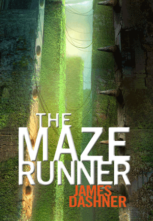
The Maze Runner. Because I just really love mazes. And this one looks so huge and mysterious and green.
And last but not least,
Wizards. I don't like this cover as much from a distance (which is why it's last on the list), but close up I find it quite fascinating. Just the wizard floating, and the wizard's half-shadowed face, and the darkness of the hills behind him... I don't know really, but I find it interesting.
Runners Up (in No Particular Order): The Bad Catholic's Guide to the Catechism because it's funny and it has happy, playful nuns;
The Icebound Land, because it's all blue and metal and there's this awesome knight charging;
Catalyst because it's green and swirly;
Cuckoo Song because it's really creepy.
P.S. See also my previous lists:
2012,
2013.


No comments:
Post a Comment